If your telemetry, maintenance, quality, and supplier data live in separate systems, you will spot many risks too late. This article shows how I would connect those data sources in Azure, score risk from 12 to 24 months of past outcomes, and send alerts before delays, defects, or safety issues pile up.
Here’s the core idea in plain English:
- I start with 3 to 5 narrow risk scenarios, not a giant platform build
- I map each scenario to Azure services like Data Factory, Data Lake, Databricks, Azure Machine Learning, Azure Monitor, and Power BI
- I use batch scoring by default and near real-time scoring only when timing changes the decision
- I build features around trends such as late supplier signals, defect rates per 1,000 units, MTBF, WIP aging, and telemetry drift
- I validate models with precision, recall, F1, and calibration instead of accuracy alone
- I route alerts by risk type, such as:
- Delivery: lead time deviation over 15%
- Quality: first-pass yield below 92%
- Safety: vibration or temperature above 2 standard deviations from baseline
- I publish one scored output with risk score, band, timestamp, model version, and top drivers
- I show the results in Power BI pages for overview, delivery, quality, and safety
- I lock down access with Entra ID, RBAC, MFA, managed identities, Key Vault, and audit logs
- I keep safety-related records for 7 to 10 years where policy requires it
A few points matter more than everything else:
- Named owners must run the review process
- Score definitions must stay fixed and versioned
- Alerts must lead to a clear action
- Audit trails must cover data lineage, model versions, threshold changes, and access history
Here’s a short comparison of the main Azure surfaces used in the setup:
| Tool | Main job | Best for |
|---|---|---|
| Power BI | Review dashboards | Delivery, quality, and safety meetings |
| Azure Monitor | Alerting and log rules | Score-based notifications and pipeline watch |
| Azure ML | Model training and deployment | Batch and endpoint scoring |
| Databricks | Data prep and feature work | Large-scale feature pipelines |
In short: I’d treat this as a governed risk system, not just a dashboard. The article walks through the full path from scenario selection and data prep to scoring, alerting, and review use.
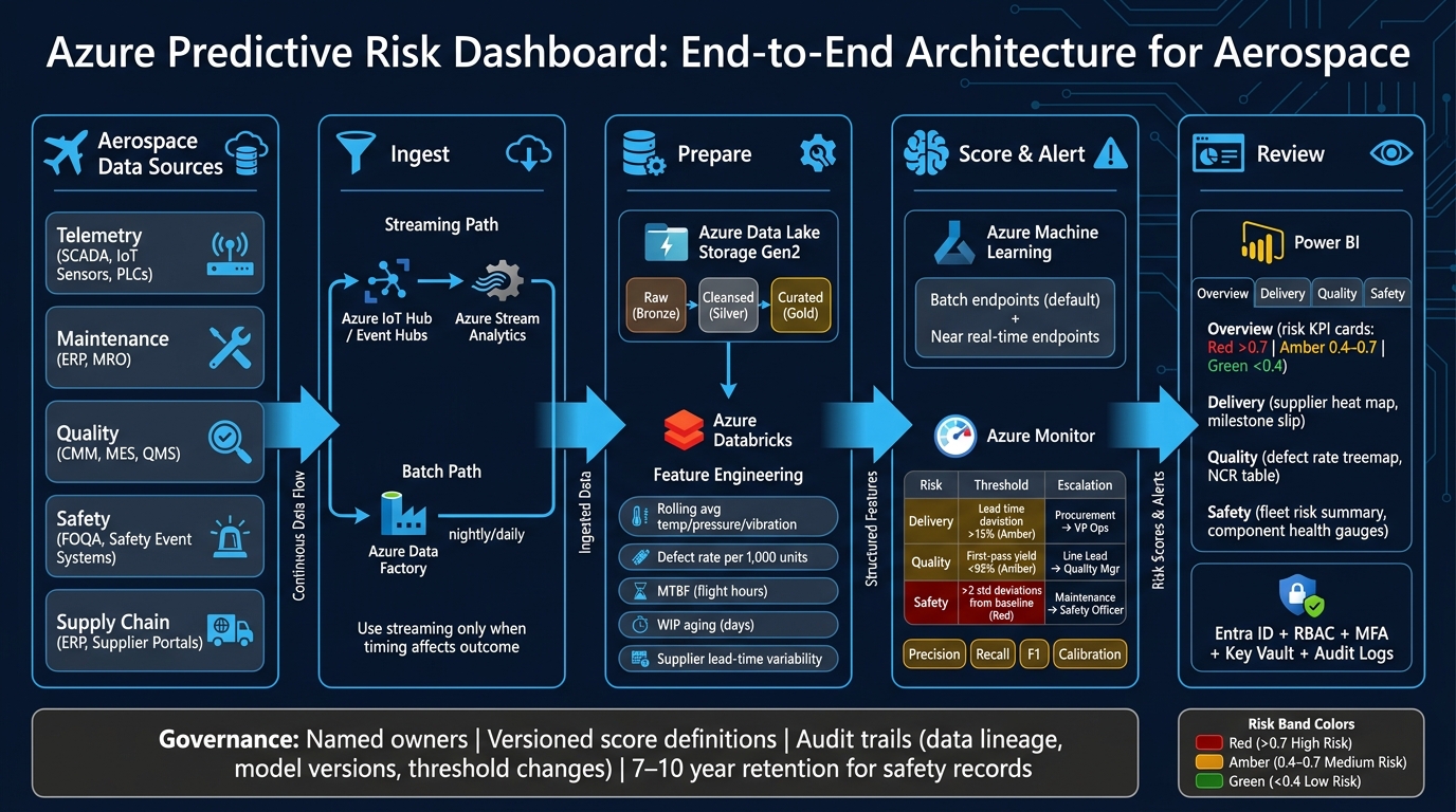
Azure Predictive Risk Dashboard: End-to-End Architecture for Aerospace
1. Define risk scenarios and map the Azure architecture
Choose the risk scenarios to address first
Before you build anything in Azure, decide which risks you want to predict. Start with the decision, not the data. If a dashboard doesn’t lead to a clear action - expedite a supplier, add an inspection step, or adjust a maintenance interval - it won’t change much in review meetings.
Keep the first dashboard tight. Focus on 3 to 5 scenarios where you already have 12 to 24 months of historical outcomes and a written response playbook. Good places to start include late part delivery risk that triggers supplier escalation, nonconformance escalation risk that triggers extra inspection, and component health deterioration that adjusts maintenance timing.
A short workshop with operations, engineering, quality, and finance is usually enough to rank the options. Score each scenario on:
- business impact tied to a KPI, such as on-time delivery, cost of poor quality, or MTBF
- data readiness
- clarity of the next action
Then pick the top one or two in each domain.
Before you choose any Azure service, map each scenario to its data source, scoring cadence, and alert action. That keeps the build tied to what the business will actually do.
Match each architecture layer to Azure services
Once the scenarios are clear, map them to Azure services one layer at a time. This keeps the design tied to the use case instead of drifting into a generic reference diagram.
| Layer | Azure Service | Aerospace Use |
|---|---|---|
| Streaming ingestion | Azure IoT Hub, Azure Event Hubs | Aircraft/test-stand telemetry, shop-floor sensor streams |
| Batch ingestion | Azure Data Factory | Nightly loads from ERP, MES, PLM, QMS, and MRO systems |
| Storage | Azure Data Lake Storage Gen2 | Raw, cleansed, and curated zones for telemetry, work orders, nonconformance records |
| Analytics & modeling | Azure Databricks | Feature engineering and large-scale processing |
| Model training & deployment | Azure Machine Learning | Experiment tracking, model registry, batch and online scoring endpoints |
| Monitoring & alerting | Azure Monitor, Log Analytics, Action Groups | Alerts when risk scores cross defined limits, notifications to supply chain and maintenance teams |
| Visualization | Power BI | Delivery, quality, and safety dashboard pages by audience |
IoT Hub makes sense when sensors use IoT protocols like MQTT or AMQP and you need device management at scale. Event Hubs is a better fit when telemetry already comes grouped through on-premises systems and the main need is high-throughput ingestion. Data Factory handles batch extracts from ERP, MES, PLM, QMS, and MRO systems.
Use this service map to set environment boundaries, permissions, and retention rules early, not halfway through the build.
Set governance boundaries before building
After you pick the first scenarios, set the controls for data access, model changes, and retention. If governance gets pushed to the end, it usually turns into costly rework. Define your Azure resource hierarchy, access roles, and retention rules before any pipeline or model moves into development.
CUI classification, access controls, and audit trails are architecture requirements, not side tasks. They shape whether people will trust the risk scores in delivery, quality, and safety reviews.
At a minimum, split production and non-production into separate subscriptions, such as Aerospace-Prod and Aerospace-NonProd. Organize resource groups by domain and environment - for example, rg-delivery-risk-prod and rg-safety-risk-dev. Keep the management group hierarchy to three or four levels.
For access control, assign Azure RBAC roles to Entra ID groups, not to individual users. Data engineers should have contributor rights on data resources. Business users should get read-only access to Power BI and curated tables. Safety engineers and quality managers should use custom roles that let them view risk scores without changing pipelines or models.
Turn on Azure Key Vault for secrets, use managed identities for service-to-service auth, and enable Activity Logs and Log Analytics from day one.
Retention rules need the same level of attention, especially for safety-related data. U.S. regulatory and company requirements often point to 7 to 10 years for safety-critical records [1]. Set those policies in storage and retention settings before data starts flowing in.
2. Connect aerospace data sources and prepare model inputs
Ingest telemetry, maintenance, quality, safety, and supply chain data
Once the first use cases are set, connect only the data required to score them. That keeps the setup lean and avoids dragging in data no one will use. Start with five core domains: telemetry, maintenance, quality, safety, and supply chain. Then map each source to the right refresh pattern and ingestion route.
| Data Domain | Common Systems | Ingestion Method | Refresh Cadence |
|---|---|---|---|
| Telemetry | SCADA, PLCs, IoT sensors | Azure IoT Hub / Event Hubs → Stream Analytics or Databricks Structured Streaming | Streaming |
| Maintenance | ERP and MRO platforms | Azure Data Factory or Synapse pipelines | Nightly or shift-based |
| Quality | CMM, MES, QMS | Change data capture (CDC) or API feeds | Near real-time |
| Safety | Safety event systems, FOQA, safety audits | OCR / Document Intelligence + batch ingestion | Batch or on-demand |
| Supply chain | ERP, supplier portals | API / Data Factory | Daily or hourly |
Use streaming only when timing has a direct effect on the outcome, like live engine telemetry or shop-floor alerts. For maintenance logs, quality records, and supplier data, batch ingestion through Azure Data Factory is often simpler and lower cost. If teams are still dealing with scans or spreadsheet dumps, Azure AI Document Intelligence or OCR can turn that mess into structured inputs you can actually use.
Build time-based features that reflect risk
Raw data rarely helps on its own. The job here is to turn it into time-based features that point to risk in a way reviewers can check week after week.
For telemetry, that usually means rolling averages and standard deviations for temperatures in °F, pressures in PSI, and vibration amplitude across set windows. Add delta features too, so you can compare current readings against a past baseline. Then layer in threshold-breach counts, such as how many times hydraulic pressure went above a set PSI limit in the last 50 flight hours.
Maintenance and quality data need a different lens. Useful inputs include open NCR counts by part family, defect rates per 1,000 units produced, mean time between failures in flight hours, and WIP aging in days. Safety and supply chain data can add incident frequency per flight hour and supplier lead-time variability.
Store these transformations in reusable Databricks notebooks or Azure ML pipelines. Then publish the outputs as Delta Lake gold tables with plain, readable names like risk_features_flight_level or risk_features_supplier_daily.
Structure a scoring dataset and define labels
Each row in the scoring dataset should represent one steady unit of analysis: a flight, a component-day, a work order, or a supplier-week. Don’t mix those units in the same dataset. That’s a common way to create label leakage and drift.
A solid schema should include:
- Identifiers such as tail number, component serial number, flight ID, work order ID, supplier ID, and production line
- A UTC timestamp
- Numeric features like rolling averages, pressures, defect counts, MTBF in flight hours, and WIP aging in days
- Categorical states such as aircraft model, maintenance category, and supplier criticality tier
- Event flags, like “temperature threshold breached in last 10 flight hours” or “open NCR present”
Labels should come from past outcomes and be written in plain business terms. For delivery risk, define delay vs. on-time by comparing actual completion dates to planned dates, using a rule such as more than two days late. For quality risk, define high-risk vs. stable at the part level based on NCRs or test failures within the first 500 flight hours. For safety risk, use incident severity codes from safety event logs to define high vs. low risk.
Write each label in business language first, then codify it in versioned SQL or notebook logic. Trace every label back to source records with Purview lineage. Lock those label versions in place now, so model training and scoring in the next step use the exact same definitions.
3. Train models, deploy scoring, and configure alert logic
Train and validate risk models in Azure Machine Learning and Databricks
Start with the versioned scoring dataset in Azure Databricks for data prep and feature engineering. From there, train the model and register the approved version in Azure Machine Learning.
When you judge model performance, don’t lean on accuracy alone. For risk use cases, precision, recall, F1, and calibration matter more.
- Precision shows how often a flagged risk is actually real.
- Recall shows how many real risks the model caught.
- F1 helps balance those two.
- Calibration shows whether predicted probability bands like low, medium, and high match what happens in practice.
That tradeoff changes by use case. In safety work, a missed risk often costs more than a false alarm. In delivery and quality, the math can flip a bit, because too many false alerts can make reviewers tune out the scores. And calibration matters for dashboards. If a weekly review shows a “high-risk” band, people need to trust that the label means something in day-to-day operations.
Use time-based validation, not random splits. Aerospace outcomes change over time, and random splits can leak future data into training. That gives you a model that looks good on paper but falls apart in production.
Once the model clears validation, register it in the Azure ML model registry with:
- a snapshot of the training dataset
- feature definitions
- performance metrics
Before deployment, set promotion approvers and rollback steps. Also plan for periodic retraining as fleet conditions, supplier behavior, or inspection regimes shift.
Use the versioned labels and feature set from the scoring dataset, then move the approved model into scheduled scoring.
Deploy batch and near real-time scoring pipelines
Use batch scoring by default. Azure ML batch endpoints run asynchronously on compute clusters, score large datasets on a schedule, and write results to governed storage. That setup works well for nightly scoring of open production orders, supplier queues, or work packages.
Use near real-time endpoints when timing matters more, such as telemetry-driven events or safety cases that need action right away.
After deployment, point every consumer to the same scored output table. Each scored record should include the entity identifier, risk score, risk band, prediction timestamp, model version, and top contributing features.
The timestamp and model version are especially important for audit trails. Without them, it gets messy fast. A dashboard alert shows up, someone asks where it came from, and now the team has to guess which model state produced it.
Power BI dashboards, audit workflows, and operational systems should all read from that same governed output table so everyone is working from the same set of scores.
Turn risk scores into Azure Monitor alerts
Use Azure Monitor log alert rules with KQL to turn scored outputs into alerts people can act on. KQL works well here because it can look across a rolling window and spot patterns, not just one-off events.
That matters. A single-point trigger can flood teams with noise. Pattern-based logic is usually better because it can catch things like consecutive high-risk scores, sharp score jumps, or risk that stays above a threshold for too long.
The threshold logic, severity, and escalation path should change by risk type. Here’s a solid starting point:
| Risk Dimension | Primary Data Sources | Typical Threshold Logic | Escalation Path |
|---|---|---|---|
| Delivery | ERP (Epicor), Supplier Portals | Lead time deviation > 15% or “Late” status on critical path items | Procurement Lead → Production Planner → VP Operations |
| Quality | MES (Hexagon), CMM (Zeiss), QMS | First-pass yield < 92% or SPC trend showing 3+ points toward limit | Line Lead → Quality Engineer → Quality Manager |
| Safety/Telemetry | SCADA, IoT Sensors, PLC | Vibration or temperature exceeding 2 standard deviations from baseline | Maintenance Tech → Plant Manager → Safety Officer |
Use alert processing rules to suppress notifications during planned maintenance windows and route only critical alerts to on-call teams. Safety alerts should have tighter thresholds, shorter suppression windows, and immediate escalation.
These alert rules should feed delivery, quality, and safety review workflows.
4. Build dashboard views in Power BI and use them in reviews
Create dashboard pages for overview, delivery, quality, and safety
Once your scored outputs are ready, Power BI becomes the review layer. The point isn’t to make a pretty dashboard. It’s to give teams something they can use to make decisions.
A simple four-page setup works well: overview, delivery, quality, and safety. Keep the layout the same on each page so people don’t have to re-learn the screen every time. Put KPI cards at the top, trends in the middle, and an action table at the bottom.
The overview page should bring the highest-risk items to the surface first. Show aggregated risk scores by domain as KPI cards with clear thresholds: red above 0.7, amber between 0.4 and 0.7, and green below 0.4. Add a trend line with weekly average risk by major program. Then include a table of open high-risk items with risk score, owner, due date, and days in high-risk state. A last 7 days spike filter with conditional formatting makes it much easier for executives to see what changed since the last review.
The delivery page should center on schedule and supplier risk. A matrix with average delivery risk score and on-time completion rate by program works well next to a milestone table that shows planned date, forecast date, schedule slip in days, and risk score. Add a supplier heat map with rows for suppliers and columns for on-time delivery %, defect rate, and risk score trend. That gives supply chain teams a fast read on which suppliers need escalation.
The quality page should pull defect risk together by part family and production line. A treemap or bar chart can show average risk score and defect rate per 1,000 units. Pair that with a nonconformance table listing severity, days open, and corrective action status. This lines up with how quality teams usually triage defects and open actions.
The safety page should focus on fleet-level risk. Include a tail-level safety risk summary, component health gauges for engines, avionics, and hydraulics using consistent units, and a maintenance prioritization table with recommended actions and regulatory impact flags.
Across all four pages, apply row-level security so users only see the programs, plants, or supplier data they’re allowed to access. In regulated aerospace settings, that isn’t optional.
Choose the right dashboard surface for each audience
Different teams need different views of the same scores. Match the tool to the audience and the job in front of them.
| Tool | Strengths for aerospace risk oversight | Limitations in regulated environments |
|---|---|---|
| Power BI | Rich visuals, cross-domain aggregation, row-level security, PDF export for regulatory reviews | Data lineage must be validated; exports need controlled distribution to avoid unmanaged spread of regulated data |
| Azure Monitor | Near real-time alerts, native Azure log integration, strong for operational risk and system availability | Less suited for executive summaries; governance on log access is critical |
| Application Insights | Deep application telemetry - errors, performance, usage - useful for software and digital system risk | Focused on application-level signals, not business KPIs; needs aggregation elsewhere for compliance reporting |
If the audience is a program manager, quality leader, or safety board, use Power BI. If the audience is an engineer watching telemetry ingestion or debugging a scoring pipeline, use Azure Monitor. Same scores, different job to do.
Use risk scores in delivery, quality, and safety review workflows
Use the same score bands and model version shown in the scored output table across every review. That keeps delivery, quality, and safety teams working from the same playbook.
Program managers use the delivery page to sort milestones by risk score and schedule slip. From there, they decide what to resequence or expedite. If a supplier’s risk score goes above 0.7, that should trigger a corrective action ticket. When someone clicks a high-risk item in Power BI, it should open the related record in the ERP or Azure DevOps so the manager can assign work or adjust dates without bouncing between tools.
Quality leaders use risk scores to triage nonconformances before weekly meetings. High-risk items move into 8D investigations and tighter verification steps. Lower-risk items stay on the standard corrective action path. Watching risk score trends for the affected part families after a corrective action goes in helps show whether the fix worked. It also helps teams give extra attention to items with possible FAA or DoD impact during the review.
Safety boards should anchor recurring reviews around the fleet risk summary and the maintenance prioritization table. Red items above 0.8 stay in the current meeting. Amber items get scheduled. Green items stay monitored.
Tie each page to a named owner, a review cadence, and a clear action. That’s how the dashboard starts driving decisions instead of just sitting there as another reporting layer.
End to End Predictive Maintenance Use Case with Azure ML & Azure IoT Edge
Conclusion: Launch a production-ready aerospace risk dashboard on Azure
A production Azure risk dashboard should do more than show scores. It needs to turn those scores into action during delivery, quality, and safety reviews through governed pipelines, scoring, alerts, and role-based Power BI views.
Start small. Pick one narrow use case and prove the full action loop end to end before you expand into other risk areas.
Once the first use case is live, lock down auditability. Auditability is non-negotiable: retain lineage, model versions, threshold changes, alert recipients, and access logs. Model and data-source changes should be handled as documented, reviewed, and approved changes under AS9100.
After launch, treat the dashboard like any other operational system. It needs monitoring, feedback loops, and periodic retraining as process conditions shift. Before go-live, assign a named owner for the data pipeline, model updates, and alert routing. Then review false positives, missed risks, and alert fatigue on a fixed cadence, and tune features and thresholds as needed.
FAQs
How much historical data do we need to start?
You don’t need to connect every system on day one.
Start with two or three high-value sources - for example, your ERP and MES - and use them to answer one specific unresolved operational question. That keeps the first step focused and easier to manage.
In some aerospace programs, teams work with deep history: eight years of quality records, production logs, and ERP transactions, adding up to 12 TB of data. For an initial setup, though, the priority is simpler: build a reliable data model across those first systems.
When should we use batch scoring instead of real-time scoring?
Use batch scoring when instant feedback isn’t the goal, especially for complex queries and analytical tasks where depth matters more than low latency.
Real-time scoring works best for operational visibility, IoT sensor monitoring, and defect prevention. Batch scoring is a better fit for data warehouse workloads and complex SQL-based analytics that are too heavy for direct, real-time dashboard queries.
Who should own alerts, thresholds, and model changes?
Ownership needs to be clear. Technical teams should handle the architecture. Operations and quality engineers should own thresholds and alert logic because they know frontline conditions and can check whether outputs line up with what’s happening on the ground.
Designated owners should be responsible for model changes and regulatory updates, keeping the audit trail, watching performance, checking results against manual processes, and supporting compliance.