If you want AI supplier scorecards to work, start with data and controls - not the model.
From what I see in this study, the main lesson is simple: AI scorecards help teams spot supplier trouble sooner, but they only work when data is clean, metrics match across systems (often difficult when your ERP is a bottleneck to AI), and every score change can be traced. In one case, a company tracked 2,500+ suppliers across 49 risk metrics. In another, a $180,000 pilot stalled until a 16-week data cleanup lifted field accuracy from 68% to 97.2%.
Here’s the short version:
- I’d treat modern scorecards as a shared tool for procurement, quality, production, and compliance
- I’d track both past results and early warning signs, not just monthly KPIs
- I’d use AI models like Random Forest and XGBoost for mixed supplier data
- I’d make sure teams can see why a supplier’s score changed
- I’d expect most failures to come from bad records, split IDs, and weak data links
- I’d keep human review in place for supplier holds, corrective action, and status changes
A few numbers stand out:
- Manual scorecards can have about 12% error from hand entry
- Automated pipelines can cut that to under 2%
- One AI compliance setup flagged expiring certifications 90 days early
- The same setup cut manual checks by 85%
What matters most is not fancy scoring. It’s using the scorecard in a way that people can trust, check, and act on. That is the core takeaway from this study.
How to Create a Supplier Scorecard that Actually Works
What Modern Supplier Scorecards Measure
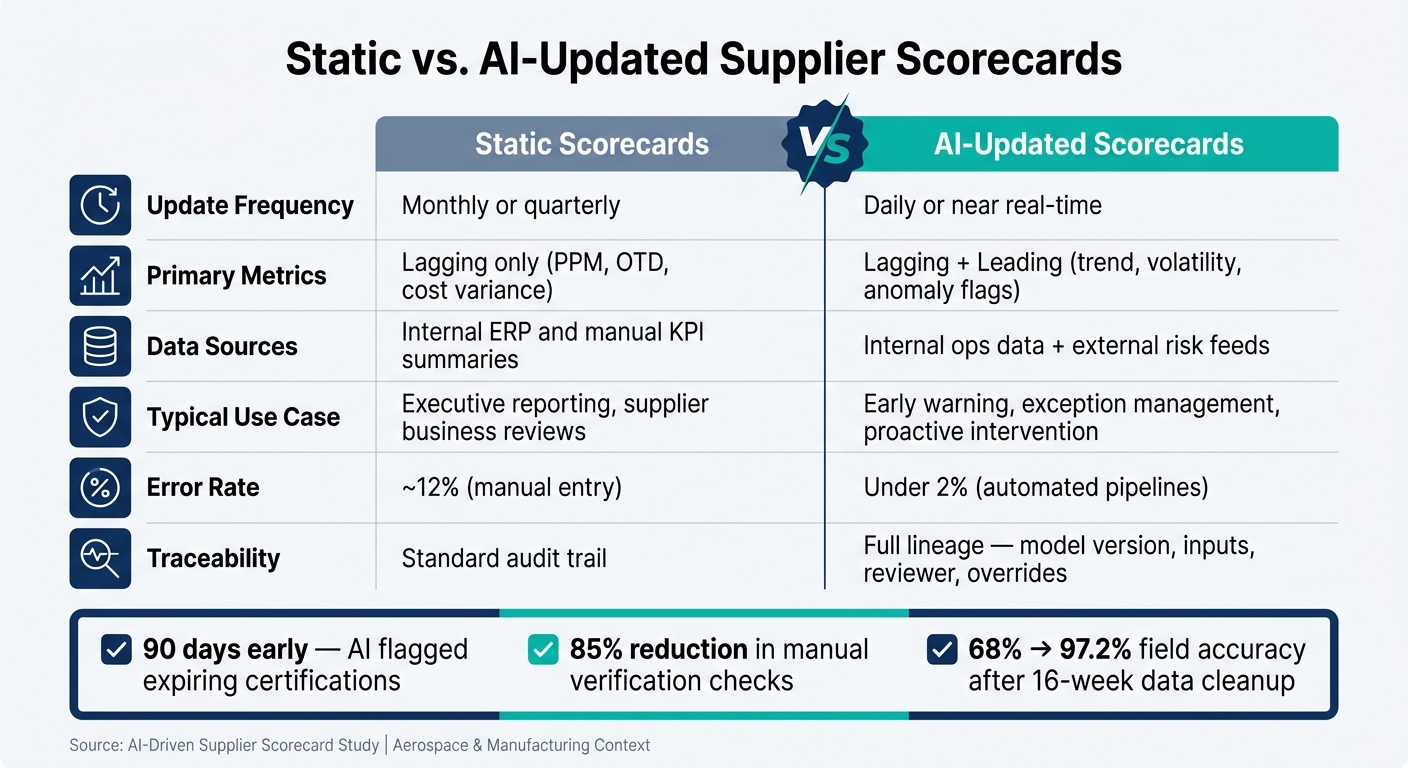
Static vs. AI-Updated Supplier Scorecards: Key Differences at a Glance
Core Quality and Delivery Metrics
Aerospace and manufacturing scorecards tend to watch the same core signals: PPM, FPY, escape rate, corrective-action speed, Cp/Cpk, OTIF, and lead-time stability. These metrics show how a supplier is performing where it counts.
Some of these are lagging metrics. They tell you what already went wrong. Others are leading metrics. They hint at trouble before scrap, escapes, or missed shipments start piling up. Put together, they create the starting point for supplier risk scoring.
Targets vary by program, but aerospace usually sets a tighter bar than industrial manufacturing. Top-tier benchmarks often include under 1,000 PPM, 99%+ OTD, and escape rates below 1 PPM.[6][7][8][9]
Cost, Compliance, and External Risk Signals
Quality and delivery only show part of the picture. If a scorecard is built for AI use, it also pulls in TCO, compliance, and outside risk signals that can affect supply continuity.
TCO includes things that don’t always show up in a simple unit-price view, like freight, rework, and working-capital impact. Cost variance can also point to hidden problems, such as freight creep or added surcharges.
Compliance data matters just as much. Common inputs include:
- Certification status
- Audit findings
- PPAP/FAI acceptance
- Closure speed on open issues
In aerospace, this matters a lot. A part can arrive on time and meet spec, but still be unusable if the documentation is incomplete.
Then there are the outside pressures: financial health, single-source exposure, geopolitics, and logistics disruption. Those risks get even harder to ignore when tier-two and tier-three suppliers can interrupt continuity upstream.
This is one area where AI shows fast results. An AI compliance monitor flagged expiring certifications 90 days early, cut manual verification 85%, and eliminated audit gaps.[2]
Static Scorecards vs. AI-Updated Scorecards
The big difference comes down to cadence. Static scorecards tell you what happened last month or last quarter. AI-updated scorecards refresh after each shipment, inspection, or risk event. That changes how teams use them day to day.
| Dimension | Static Scorecards | AI-Updated Scorecards |
|---|---|---|
| Update frequency | Monthly or quarterly | Daily or near real time |
| Primary metric types | Lagging (PPM, OTD, cost variance) | Lagging + leading (trend, volatility, anomaly flags) |
| Data sources | Internal ERP and manual KPI summaries | Internal operational data + external risk feeds |
| Typical use case | Executive reporting, supplier business reviews | Early warning, exception management, proactive intervention |
| Traceability requirements | Standard audit trail | Stronger - users need a reason for score changes |
| Error rate | Higher (~12% due to manual entry)[1] | Lower (<2% via automated pipelines)[1][4] |
A static scorecard is fine for reporting. An AI-updated one is built for action. It helps teams spot drift early, understand why a score moved, and step in before a late shipment turns into a line-down problem.
How AI Models Score Supplier Risk and Performance
Common Model Types and Scoring Methods
AI-updated scorecards need models that can score mixed supplier data fast and still show why a score moved. That’s why many teams lean on tree-based supervised models like Random Forest, XGBoost, and gradient boosting tools such as LightGBM. They work well with tabular supplier data because they can process different kinds of inputs at the same time, including delivery metrics, compliance flags, quality events, and financial indicators.
The big tension here is simple: better prediction vs. easier audit review. A comparative analysis of ensemble models for military procurement risk, based on 2021–2025 data and 56 financial, economic, and behavioral indicators, found that tree-based ensembles beat logistic regression while still allowing interpretable feature-importance charts.[10]
| Model Type | Typical Use Case | Key Strength | Interpretability |
|---|---|---|---|
| Random Forest | Late-delivery risk, composite performance scores | Handles noisy data well; works with many features | Feature importance plus SHAP for single-score review |
| XGBoost | Binary disruption prediction, risk index regression | Strong results on structured supply chain data | Often needs SHAP or partial dependence plots for audit review |
| Gradient Boosting (GBM, LightGBM) | Quality escape probability, financial risk scoring | Flexible loss functions; handles imbalanced data well | Similar to XGBoost; raw importance can be tougher to read |
| Ensemble (stacking/blending) | More stable scores across supplier segments | Can improve stability and prediction quality | Harder to explain; often paired with a champion-model narrative |
Data Pipelines and Feature Inputs Behind the Scores
Internal systems do a lot of the heavy lifting. Data from ERP, MES, PLM, and quality systems supplies delivery, quality, change, and CAPA history. Teams usually roll that data into 90-day and 12-month windows so the model can spot both short-term slips and longer patterns.
External feeds fill in the gaps. News analysis can flag labor disputes, environmental incidents, or other disruptions before they show up in delivery numbers. Regulatory data from agencies like the FAA or OSHA can point to enforcement actions. Financial indicators such as credit rating changes, debt ratios, and restructuring news can hint at continuity risk before missed shipments start piling up. These signals are linked to internal supplier records with identifiers like DUNS numbers, then pushed through the same scoring pipeline.
| Data Category | Source Systems | Key Feature Inputs |
|---|---|---|
| Quality | QMS, MES | Nonconformance rate per million parts, repeat nonconformance ratio, average days to close CAPA |
| Operations | ERP, MES | On-time delivery %, average days late, line stoppages per quarter |
| Compliance | Supplier portals, regulatory feeds | Certification status, enforcement actions |
| Procurement | ERP, contract management | Spend concentration, emergency order frequency, PO cycle time |
| External risk | News APIs, credit bureaus, sanctions lists | Sentiment score, credit rating change, sanctions flag |
Some teams also use graph models to connect supplier, sub-tier, and news signals.[5]
Why Explainability Matters for Procurement and Quality Teams
A supplier score matters only if people can make sense of it. Procurement, quality, and compliance leaders need to see which inputs pushed the score up or down and whether that lines up with what they’re seeing in day-to-day operations.
SHAP explanations help by showing which inputs moved a specific score. That gives teams a clearer way to review a flagged supplier, question a result, and document the path behind a decision for internal governance. In aerospace and defense, that paper trail matters because supplier calls can affect regulatory, contractual, and safety duties.
Studies also show that explainable models usually get better adoption than black-box ones, since practitioners need to compare model output with field knowledge when the two don’t match.[11][12] Explainability isn’t just a nice extra. It’s part of what makes the score usable in review and audit.
That same need for transparency leads straight into governance, auditability, and access control.
Key Limits and What Production Rollout Requires
Where AI-Driven Supplier Scorecards Break Down
Once scores start shaping sourcing decisions, holds, or corrective action, bad data stops being a reporting problem and turns into an operating risk. In production, failures usually begin with the data layer, not the model itself.
Supplier records are often split across systems, names, and IDs. That means the same supplier may show up more than once, or appear with missing site-level details. Before any rollout, teams should consult a data readiness checklist to establish master supplier records and minimum quality thresholds. In aerospace, one missing record can bury a risk that later surfaces in an audit, a quality issue, or a delivery miss.
Proxy signals create a second problem. Metrics like on-time delivery and minor nonconformance rates are useful, but they don’t always show the full picture. A supplier can look fine in the scorecard while process drift is building underneath. To sort supplier risk from buyer-side noise, models need to account for schedule changes, engineering revisions, and late PO updates.
Rare but high-impact failures make things harder. Serious defects and systemic escapes are supposed to be rare, so labeled examples are limited. That often pushes models to become too sure about “no issue” predictions. Anomaly detection, near-miss signals, and human review can help, but the shortage of labeled examples doesn’t go away.
Governance, Auditability, and Access Controls
Explainability matters, but it isn’t enough on its own. If a score can influence corrective action, a sourcing hold, or preferred-supplier status, teams need to trace the full path behind it: which model version created the score, which inputs it used, who reviewed it, and whether someone overrode the result.
| Dimension | Standard Analytics | AI-Driven Supplier Scoring |
|---|---|---|
| Decision impact | Informs human judgment | May trigger reviews, holds, or sourcing changes |
| Model transparency | Simple KPI aggregations | Requires explainability artifacts and feature-importance records |
| Versioning | Dashboard changes rarely need approval | Model changes must be versioned, approved, and reversible |
| Data lineage | Basic ETL tracking | Full lineage from raw inputs through features to scored outputs |
| Access control | Broad reporting access | Role-based access with stricter controls for scores affecting supplier standing |
| Audit requirements | Logs views | Logs the scores used, overrides, and dispute outcomes |
Production rollout needs more than a dashboard. It needs a model registry, documented training data, clear feature definitions, immutable logs, role-based access, and approval workflows. Human approval should stay in place for corrective actions, preferred-supplier changes, and sourcing holds.
Deployment Patterns and Architecture Options
After governance, the next issue is operating cadence. In production, scoring should run as a closed loop: ingest data, validate it, score it, route exceptions, and track corrective action.
Batch scorecards are usually the first launch pattern because they fit the supplier review rhythm most teams already use. As trust builds, some groups add near-real-time scoring for critical suppliers or parts. That can mean pulling in receipt transactions, inspection results, and schedule changes as they occur. Event-driven alerting adds one more layer, and this is where things can get messy fast. Every threshold and trigger condition has to be documented, tested, and auditable.
A lot of teams land on a hybrid setup. Batch scores support dashboard-level review, while near-real-time or event-driven methods handle operating alerts. For production rollout, a governance layer such as Ryshe Quanta can enforce policy, preserve audit logs, and connect ERP, quality, and workflow systems.
| Deployment Pattern | Best Use | Key Tradeoff |
|---|---|---|
| Batch scorecard | Monthly or weekly review | Lower complexity; slower response to emerging issues |
| Near-real-time scoring | Continuous monitoring of critical suppliers | Higher data quality and engineering burden; more audit volume |
| Event-driven alerting | Immediate escalation on exceptions | Lowest latency; requires rigorous threshold design and audit coverage |
Conclusion: What Decision-Makers Should Prioritize
Taken together, the rollout requirements come down to three main priorities.
First, the main bottleneck is usually data readiness, not model complexity. Across the research, companies that hit roadblocks with AI-driven supplier scorecards usually run into the same issues: weak data quality, disconnected systems, or gaps in governance. The algorithm itself often isn’t the main problem.
A 2025 Ryshe case study makes that plain: a $180,000 AI pilot failed until a 16-week data foundation build pushed critical field accuracy from 68% to 97.2%, fixed 47 conflicting term definitions, and connected seven siloed systems. The first production model launched 60 days after go-live.[3]
Second, governance has to fit the model’s decision impact. Procurement, quality, and engineering teams won’t use scores they can’t explain or defend. In regulated settings, where FAA, DoD, and OEM audits are a day-to-day constraint, governance needs to come before scale.
For most U.S. aerospace and manufacturing organizations, the order is pretty simple:
- Clean and connect your data first
- Define metrics the same way across plants and systems
- Build explainable scoring that procurement teams can read without a data science background
- Put governance in place before expanding scope
Advanced models can help, but only after those basics are in place.
FAQs
How much clean data do AI supplier scorecards need?
There’s no magic threshold here. In manufacturing and aerospace, supplier data is often messy: handwritten logs, legacy exports, and files that don’t follow the same format.
What matters most isn’t perfectly clean data. It’s a strong data foundation: standardized schemas, connected systems, and automated data quality checks. Data governance isn’t a one-time setup either. It’s an ongoing job, and in many cases, it takes longer than building the model itself.
Which supplier decisions should still require human approval?
Human approval matters most when the AI isn’t sure or runs into edge cases. In those moments, teams should step in and review things by hand, especially for:
- pricing discrepancies
- new vendor onboarding
- specification changes from prior orders
Any terms that go past approval thresholds should be escalated.
In regulated aerospace settings, AI can speed up classification. But final compliance and export control decisions still need human judgment.
What is the best first rollout approach for AI scorecards?
Start with a controlled 6- to 8-week pilot that runs alongside your current manual process. Keep the scope tight. Pick one high-value program or product line, then compare each AI output with the manual version. That side-by-side check helps your team build trust and confirm the results are accurate.
Before you scale, get your ERP and quality data connected and governed. It also helps to bring in procurement or operations early. They can help set exception rules, flag edge cases, and make sense of why the AI makes each decision.